Correlation, prediction, and linear functions
Contents
9.5. Correlation, prediction, and linear functions#
At least in the case of linear relationships, correlation is useful for measuring association. But it is not so useful for prediction. In particular, prediction usually requires two things:
a predicted value of the outcome (\(Y\)) for a given value of the inputs (the \(X\)s). For example, we would like to know what product from our website someone is likely to buy (\(Y\)) who is, say, age 35 (\(X_1\)), of moderate income (\(X_2\)), in good health (\(X_3\)), with two children (\(X_4\)) etc.
some notion of the “effect” on the outcome of a change to the inputs. For example, we would like to know what will happen to inflation (\(Y\)) if, say, unemployment rises by 1% (\(X\)).
We will now explore a very basic predictor, the linear model, that does both. To motivate this model, we will consider a public health example of the relationship between cigarette tax levels (tax in dollars on a pack of 20 cigarettes, cig_tax12) and the proportion of a state’s population that smokes (smoking). Let’s load the data and take a look at the relevant variables:
import pandas as pd
import matplotlib.pyplot as plt
import numpy as np
%matplotlib inline
states_data = pd.read_csv("data/states_data.csv")

plt.scatter(states_data['cig_tax12'],
            states_data['smokers12'], s=50, edgecolors="black")
plt.xlabel("cigarette tax")
plt.ylabel("smoking")
plt.grid()
plt.show()
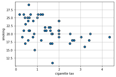
The plot suggests the relationship between \(X\) and \(Y\) is negative: when taxes are high, smoking is low (at the state level). This belief is confirmed by the correlation:
sub_smoke = states_data[["cig_tax12","smokers12"]]
sub_smoke.corr()
| cig_tax12 | smokers12 | |
|---|---|---|
| cig_tax12 | 1.000000 | -0.431504 |
| smokers12 | -0.431504 | 1.000000 |
Proposing a Linear Relationship#
What is the nature of the relationship between \(X\) and \(Y\)? It is not completely linear, but for now, we will assume it is. Indeed, a straight line of “best fit” from top left to bottom right would not seem wildly inappropriate here. That is, a straight line would do a seemingly decent (but not perfect!) job of describing how these variables are related to each other.
We can formalize this idea by asserting that \(Y\) depends on \(X\) in the following way:
or
We will call
\(a\) the “intercept” (or the “constant”). It is the value that \(Y\) takes when \(X\) is zero.
\(b\) the “slope”. It is the effect of a one unit change in \(X\) on \(Y\).
This equation is equivalent to saying that \(Y\) is a linear function of \(X\). Specifically here, the percentage of people in a state that smoke is a linear function of the tax on cigarettes in that state.
Notice: this is an assertion or an assumption: we have not “proved” the relationship is linear; we are saying that a linear relationship seems a reasonable approximation for the truth. We will see what that linear assumption would imply about the way that \(X\) affects \(Y\), and what our estimates (our predictions) of \(Y\) would be. In this way, we will move beyond what correlation, alone, can do.
So, if you give me a value for \(a\) and \(b\), I will return to you a particular straight line that gives us what we want. The question is: where do we get the values for \(a\) and \(b\)?
Recap: Linear Functions#
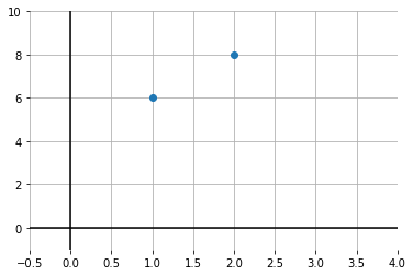
Suppose that you are told two facts:
when \(x=1\), \(y=6\)
when \(x=2\), \(y=8\)
What is the relationship between \(x\) and \(y\)? Let’s plot it:
x = ([1,2])
y = ([6,8])
plt.xlim(-.5,4)
plt.ylim(-1,10)
plt.axhline(0, color='black')
plt.axvline(0, color='black')
plt.box(False)
plt.grid()
plt.scatter(x,y, zorder=2)
plt.show()
What is the intercept? We can get a sense of that by drawing a line through both points, and seeing where it crosses the \(y\) axis:
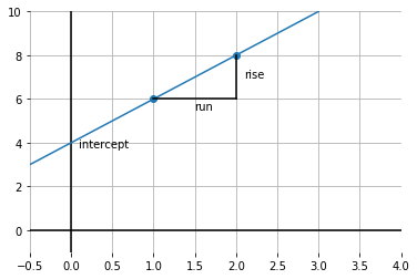
Fig. 9.7 Drawing a line through both data points#
It looks like \(y\) is 4 when \(x\) is zero. So the intercept is 4.
What is the slope of this function? Well, it is \(\frac{\mbox{rise}}{\mbox{run}}\); taken between the points, this is shown by the lines in black. In particular: \(\frac{2}{1}\) because we move along 1 unit on the \(x\) axis, and go up \(2\) on the \(y\)-axis. So that’s 2.
To recap, we have:
which is:
In our example, this is:
and
Obviously, this was not real data: these were just some numbers as an example. But the general idea will now be the same: we will fit the “best” straight line to the data and thereby learn a value for \(a\) and \(b\).
Modeling the mean of \(Y\)#
In our math example above, \(y\) took one value for a given value of \(x\). But in the real world, that won’t generally be the case: for example, people of the same height (\(x\)) might vary somewhat in terms of their weights (\(y\)). And states with the same tax rate (\(x\)) might vary somewhat in terms of their smoking percentage (\(y\)).
So we have to make a decision as to what exactly about \(y\) we will try to model as a linear function of \(x\). Here “to model as” means, basically, “simplify the relationship as.”
And for now, our interest will be in the average (that is, the mean) value that \(y\) takes for a specific value of \(x\). And it is this average that we will make a linear function of \(x\). This is sometimes written as:
Here, \(\mathbb{E}\) is called the “expectations operator” and it is telling us to take the “average of \(Y\), given \(X\)”. That means, essentially, the “average of \(Y\), taking into account how \(X\) varies in the data”. And the particular way we will do that “taking into account” is by making the average a linear function of \(X\) via \(a\) and \(b\).
It is worth noting what this assumption rules out. For example, it will rule out non-linear functions where, say, a change of one unit in \(X\) at some points in the data has a different effect (on \(Y\)) relative to a change of one unit in \(X\) at some other point in the data.
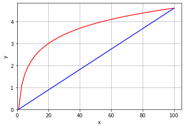
To see this, take a look at the next code snippet. It draws \(y\) as a linear function of \(x\) in blue. And it draws \(y\) as a non-linear function of \(x\) in red (in particular, this is called a log function). Notice that the slope of the linear function is constant—it doesn’t matter where you calculate the rise over the run: it is always the same. This is not true of the non-linear function: for example, the increase in \(y\) as \(x\) goes from 1 to 20 is much larger than the increase in \(y\) as \(x\) goes from 40 to 60.
xnon = np.linspace(1,100)
ynon  = np.log(xnon)
plt.plot(xnon, ynon, color="red")

plt.plot( ([1,100]), ([0,4.6]), color="blue")

plt.xlabel("x")
plt.ylabel("y")
plt.xlim(xmin=0)
plt.ylim(ymin=0)
plt.grid()
plt.show()