Empirical distributions
Contents
4.3. Empirical distributions#
As before, it will be helpful to load some libraries if you haven’t already so you can replicate the code and plots below.
#let's import numpy,
import numpy as np
# and matplotlib
import matplotlib.pyplot as plots
# and we'll use pandas briefly too
import pandas as pd
Above, we talked about a probability distribution as the way we expect the die to behave, in theory. Empirical distributions, on the other hand, are distributions of actually observed data. They can be visualized by empirical histograms.
To see why an empirical histogram might differ to a probability distribution, suppose we roll our die ten times. It cannot (the numbers don’t add up) come up “1” \(\frac{10}{6}\) times, “2” \(\frac{10}{6}\) times, “3” \(\frac{10}{6}\) times etc.
To see what happens, let’s roll it ten times and simply draw the resulting histogram. Actually, we will simulate this via the computer. But the effect is the same (albeit much faster).
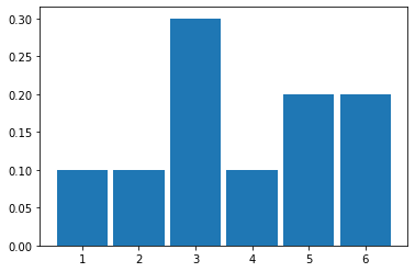
Fig. 4.2 Histogram resulting from 10 rolls of a fair die#
It looks like it came down “1” 1 time out of 10 (so 0.1), “2” 1 time, “3” 3 times, “4” happened once, and then “5” and “6” were rolled 1 time each.
Let’s try 100 rolls:
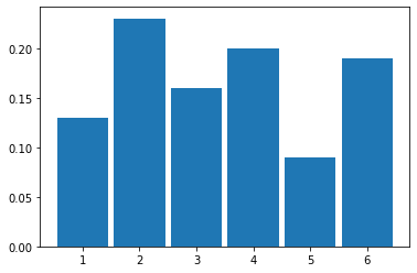
Fig. 4.3 Histogram resulting from 100 rolls of a fair die#
And then 1000 rolls:
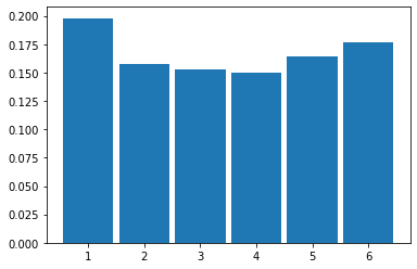
Fig. 4.4 Histogram resulting from 100 rolls of a fair die#
Law of Large Numbers#
As we increase the size of the sample (the ‘\(n\)’, which is the total number of rolls), we see that the histogram looks more and more like our probability distribution for a fair six-sided die. That is, it looks more and more similar to a discrete, uniform distribution.
This is an implication of a very general result called the Law of Large Numbers (LLN). It says that
if we repeat an experiment many, many times, the proportion of times we see a given outcome (say, a 3 or a 6) empirically will converge to the theoretical value we would expect (\(\frac{1}{6}\))
We can push this logic further. Suppose we are interested in the average (actually “mean”) value of a set of dice rolls. This average is \(\frac{1+2+3+4+5+6}{6}\), which is 3.5. That’s our expectation. As we take larger and larger samples of die rolls, the empirical average we calculate each time will converge to this theoretical, expected value. We see that in the plot below:
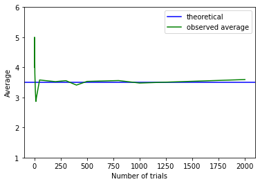
Fig. 4.5 Convergence to the theoretical, expected value#
When the sample is small, the calculated empirical average (green) is quite far away from the expected value (blue). But it soon approaches it as \(n\) increases.
Sampling from a Population#
So far, we have been sampling from (hypothetical) trials—like rolling dice. But we started out wanting to use samples to inform us about populations. And that’s where we now turn.
To represent our population, we will study \(14000\) United departing flights from San Francisco in 2015. Of course, this isn’t an especially unwieldy number as populations go, but we can still learn the key lessons. Let’s plot this population: in each case, our measurement of interest is how delayed each flight was. This can be anywhere from negative (the flight left early) to zero (it left on time) to a very large number of minutes (it was heavily delayed). Let’s plot this population distribution.
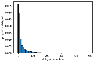
Fig. 4.6 Population distribution of United flights#
We see there are some flights that leave early or on time, and then a large number between zero and ten minutes late, a smaller number 10 to 20 minutes late and so on.
We can sample from this population. Let’s start with sample of size 10.
united = pd.read_csv('data/united_summer2015.csv')
delays = united[["Delay"]].values.flatten()
delays_sample = np.random.choice(delays, size=10, replace=False)
The histogram of delays_sample looks like this:
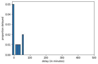
Fig. 4.7 Histogram of delays_sample, \(n=10\)#
If we increase the sample size to 100 we get:
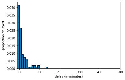
Fig. 4.8 Histogram of delays_sample, \(n=100\)#
And at \(n=1000\) we get:
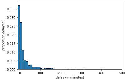
Fig. 4.9 Histogram of delays_sample, \(n=1000\)#
The key thing to notice is that, as the LLN predicts, as we increase the sample size, we get a sample that looks increasingly similar to the population. But this means that quantities we calculate from the sample will become increasingly similar to the “true” quantities in the population.
Averages: Median#
There are many features of the population we might wish to know. Let’s start with the median. This is defined as the
value “in the middle” when we rank all values of the variable; half the values are above, half the values are below.
This is equivalent to the 50th percentile, meaning
50 percent of all the values are above, 50 percent of all the values are below.
Suppose our sample of delays (in minutes) was
We rank them
and the middle value, and thus the median, is 5. There are special rules when the total set of numbers is even, or we have ties, and different software resolve this different ways. We will return to that.
Now, suppose we want to know the median delay in the population. To estimate it, we take a sample of \(n=1000\) and calculate the median of that sample.
Parameters and Statistics#
Suppose we take a random sample from our population, and calculate our statistic of interest, which is the median. For our first sample of \(n=1000\), the result is below:
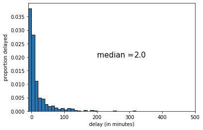
Fig. 4.10 First random sample, \(n\)=1000#
The median of this sample was 2 (minutes delay). If we draw another sample, we get the following:
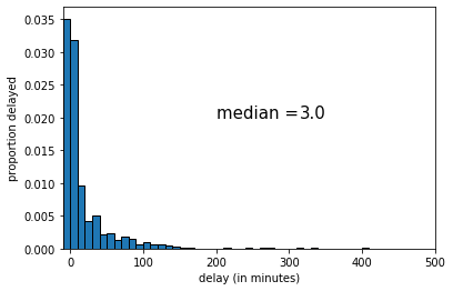
Fig. 4.11 Second random sample, \(n\)=1000#
This time the median was 3 (minutes delay). Let’s draw one more random sample:
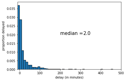
Fig. 4.12 Third random sample, \(n\)=1000#
This time the median was 2 (again). The key point here is that sample statistic depends on the random sample we happened to draw.
Sampling Distribution#
To reiterate: every time we draw a random sample, we get a different histogram (because the sample is different), and the value of the median varies. Notice that our population parameter (the population median) is considered fixed but unknown to us—it is the sample statistic that varies, not the population parameter.
A natural question is how different the sample statistic could have been, which is informative about the possible values that the population parameter could take. Put differently: given the samples we drew, how large could the population parameter be? how small might it be?
In statistics, there are two main ways to calculate what the “true” value might be:
analytically: this means we mathematically work out what values it could take.
simulation: this means we take a very large number of (large) samples, calculate the sample statistic each time, and then plot the distribution of those sample statistics.
In either case, we are obtaining the sampling distribution of the statistic. This is
the probability distribution of the statistic from many random samples. Literally for us, it will be the histogram of all the values that the statistic takes from many random draws from the population.
The sampling distribution specifies the probabilities of the all the possible values that a sample statistic can take. Notice this is not the same as the sample distribution: that is simply the histogram of a given sample we drew (see above for examples of this with median of 2 and 3 for the United data).
The reason the sampling distribution is valuable, is because it enables us to how close a statistic will fall (on average) to the parameter we are trying to estimate. This will help us do hypothesis testing.
Here is the sampling distribution for the median of the United data set. In practice, we are drawing \(5000\) samples of size \(1000\), and each time recording the median. Then we are drawing a histogram of those \(5000\) medians.
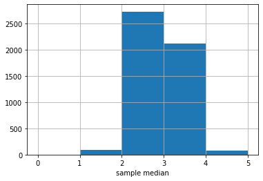
Fig. 4.13 Median sampling distribution#
The \(y\)-axis here is just the raw number (out of 5000) of medians of a particular value. It looks like most of those medians are between 2 and 3, with a sizable number between 3 and 4.
There is a large literature beyond this course about how many samples one needs to draw, and how large each one should be. For our problem here, the numbers chosen should be enough, but there are some cases where you need many more (or perhaps less) samples to obtain an accurate sampling distribution.