An early prediction example
Contents
9.2. An early prediction example#
Predicting Heights#
A very early example of a prediction problem is Francis Galton’s attempts to understand the relationship between parent’s heights and the heights their children would grow to as adults. For clarity note that Galton was interested in heredity and promoted troubling ideas on eugenics. His particular concern was the notion that societies might become more mediocre (“regress to the mean”) over time without direct material incentives to avoid this. To be abundantly clear: while his methods are influential, we strongly reject his ideas about eugenics.
Galton’s theory was that the mid-parent height (essentially the mean of the mother’s and father’s height with an adjustment for the sex of the child) should be a excellent predictor of the child’s height. In particular, he assumed that the latter would be exactly proportional to the former. In other words: taller parents would have taller children, and every inch of extra parent height would add an extra inch to the child’s height.
Curiously, this is not what he found. Let’s load his data, and take a look.
import pandas as pd
import matplotlib.pyplot as plt
%matplotlib inline
import numpy as np

galton = pd.read_csv("data/galton_data.csv")
plt.scatter(galton["mid_parent"], galton["child"])
plt.xlabel("mid parent height")
plt.ylabel("child height")
plt.xlim(62,74)
plt.ylim(62,74)

x = np.insert(galton["mid_parent"].values, 0, 62)
x1 = np.append(x,74)
plt.plot(x1, x1, 'r')
plt.show()
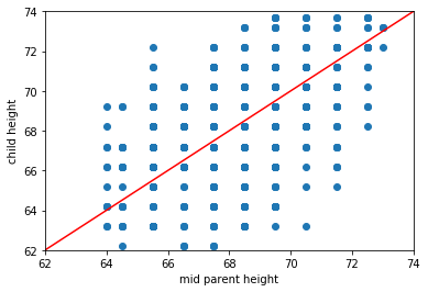
The red line is what Galton expected to see: it has a slope of 1. Notice that we added, via .insert and .append a couple of extra data points at the minimum and maximum of the plot, just so we could draw that line—but we didn’t change the underlying data.
Given his expectations, what is surprising about the plot? Take a look at the same figure, but this time with two highlighted areas: one in green, one in purple.
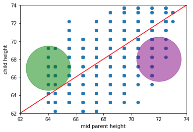
Fig. 9.1 Galton’s figure with two highlighted areas#
What’s “odd” (from Galton’s perspective) about observations in those areas?
in the green part, we have children who are (much) taller than their parent’s heights would predict (if Galton was right)
in the purple part, we have children who are (much) shorter than their parent’s heights would predict (if Galton was right)
We will return to these ideas below in more detail, but on this version of the plot we include the actual (linear) best fit line through the data in blue. Notice that it has a shallower slope than in the case of Galton’s predicted relationship.
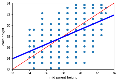
Fig. 9.2 Galton’s figure with the linear best fit line in blue#
This makes sense insofar as, while we still expect taller parents to have taller children, it isn’t as strong a relationship as Galton hypothesized.